Official Logo:

This is the document settings for the logo of the film I am making a graphic design for.


I understand that this final logo is very different to the one I had planned in the early stages and I also feel that it contradicts with some points I made, such as it being much bolder would make it easier to attract an audience. I also stated the colour of red and black juxtapose each other and that they have deep connotations such as black connoting death and red connoting danger. In this logo's case I had gone with white, not only to fit the theme of the film poster and all other products I will make, but because it connotes innocence and how the brother's guilt is taking over him with hallucinations, he must overcome his obstacles.
Official Film Poster:

This is the document settings for the film poster, I have gone with an A3 sized poster, but could be distributed in different sizes for billboards, newspapers and magazines.


)

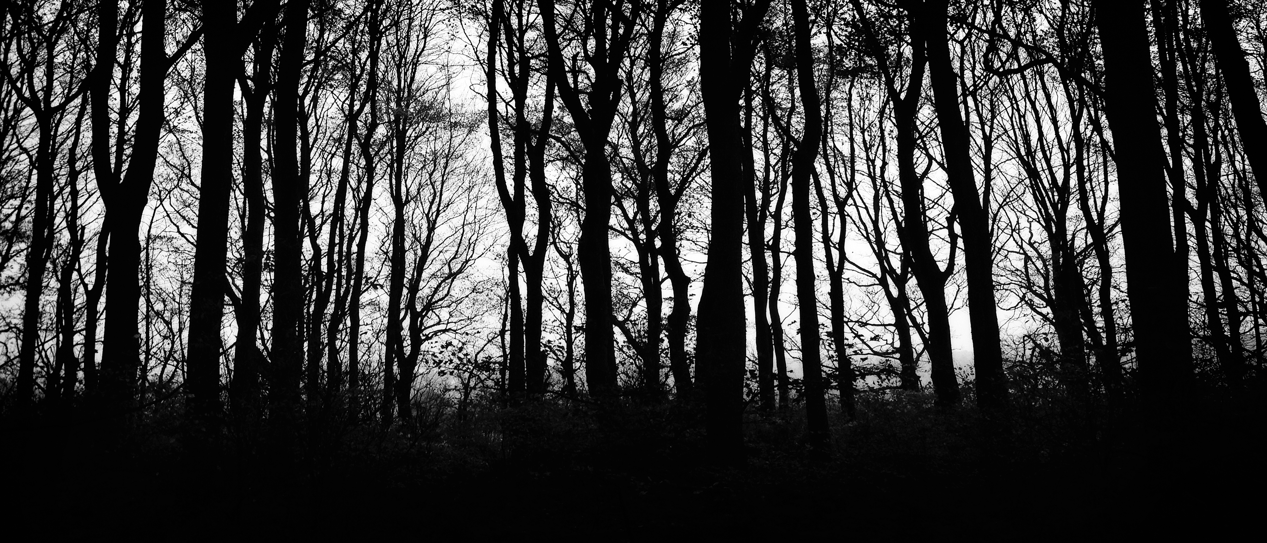
Next, I chose to add a red background and then also a forest silhouette to see how it looks, as I go on further I believe their may be a few minor changes, or even one or two major changes. The forest was set to an opacity level of 11%, I believe this makes it also look like blood streaming down the poster, which could connote that the film is about death.

I then added the draft logo to see how it would appear on the film poster and so I positioned it to the conventional size and composition on the film poster.

After a review of my planning, I had came to the conclusion that the red and black colour theme does not contrast as well as I thought. But with a white and black theme, I feel the poster will stand out a lot more to audience as the colours juxtapose well together. With the red gone I feel it will lose the connotation of danger, white although does symbolise innocence, and with the forest silhouettes standing out as a black silhouette, this could maybe connote the black, connoted as death and guilt, effecting the innocence, in this case, the main protagonists innocence as he feels guilty for the death of his brother.

I also added the updated logo (the other now being used for Unit 15) and placed it in the midsection of the film poster.

I then added the tagline for the film, following the same theme, with the font, and also made it black to contrast well against the white background.

Next, I had added the credits, day of release and the names of the actors. I also updated the look of fog, so now it looks more mysterious and eerie.

Draft 1:


Next I added a grayscale filter to the two faces.
Draft 2:

Official DVD Cover:

This is the document settings for the DVD cover, I have researched the standard size for UK DVD covers and it states that they are 272x184mm.
 Next, I placed margins to outline where the spine of the DVD cover will be. This was 129mm in from left and right, giving the width of the spine 14mm.


Then I decided to fill the spin with the fog, I also had to create a landscape version of my logo, which was also changed to black to contrast against the white background. I also added the logo onto the front cover too.
 Next I added the faces of the characters and the tagline, these being things Im having as a constant theme throughout my products. I also added a review and age rating on the front cover. On the spine I added the DVD logo, the age rating again, the production company logo, the photo and then I also flipped the title, these were all conventions I had seen on actual DVD covers.
I then also added the information on the back cover.
 I had finished the information, making sure it followed the usual conventions f that part of the DVD cover. I then also added the credits too.
 Finally I added the blurb, two images of scenes from the film and then another review, still following the conventions of the typical DVD cover.
Draft 1:


Next I placed the fog onto the DVD cover, so that it follows a consistent design with the film poster.

Then I decided to fill the spin with the fog, I also had to create a landscape version of my logo, which was also changed to black to contrast against the white background. I also added the logo onto the front cover too.

I then also added the information on the back cover.


Draft 1:

Official Web Banner:

This is the document settings for the Web Banner, I also did research for this, seeing the average sizes of them, this came to me using the dimensions 900x250mm.
 First I added the margin to split the video part of the web banner from the advertising side.
 Next, I added a shot from the trailer to show what it would look like and then after I added the continuous theme of the tree line and fog.
 Next I added the two characters faces, as seen in the other products.
 Then I added the logo, tagline and the day of release too.
 I finally added the quote/review to the web banner too.
Draft 1:


Draft 1:
